In June 2022, creative solutions agency, Machine_ won the pitch to rebrand international education solutions business, Setanta Institute. After months of work, we are thrilled to present the new logo and look, now fully implemented across all Setanta platforms.
The institute, which originated in Ireland, offers services for undergrads and postgrads in the area of human performance, through blended learning. Around 80% of Setanta’s internationally accredited programmes run as interactive online lectures, complemented by practical workshops delivered in locations across the world.
So, what did we do, exactly? Our work included: updating Setanta’s global brand CI, from the logo through to the visual language and templates for all communications.
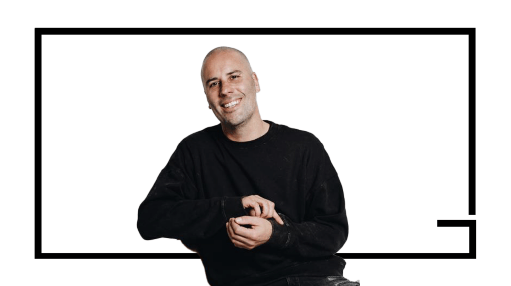
Juan Geel, who was also recently promoted to Creative Director at Machine_ Cape Town, spearheaded this project.
He has worked on multiple, global, award-winning projects, including the innovative digital platform developed by Machine_ called StoryStackr (for more information, watch the video below).
Also, click here to see more of our work.
Setanta’s new logo and brand CI explained
Speaking to the creative process, Juan explains that “Setanta wanted to retain a sense of its Irish origins. So, I took inspiration for the new logo from the ancient Irish language, Ogham and its alphabet, which is quite linear,” he explains.
“We based the icon on the “S” of the Ogham alphabet and stripped down the symbol to transform it into what you see on their website today,” says Juan.
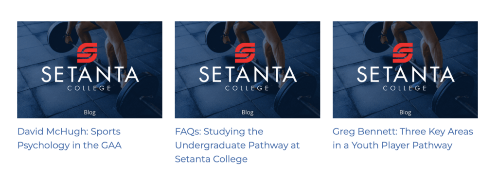
“We also looked at their previous colour palette and updated the tones to hues that are more modern, but also timeless. Another key consideration was colour psychology. The updated red tone for the icon in the logo represents energy, courage and passion,” explains Juan.
“From a font perspective, we also wanted to update the ‘serif’ font to a ‘sans serif’, which is both modern and timeless, but also easier to read. Being an e-learning institute, this was an extremely important consideration,” he says.
“Some of the other details we looked at included creating a custom filter for their image bank. This meant that no matter where their images were sourced from – as they are a global company – they would all have the same look and feel when the filter was applied,” says Juan.
“For me, it’s important that there is always meaning behind the work, especially when it comes to creating logos. Every brand CI needs to have meaning, otherwise it falls flat. You need to be able to bring in the brand story and be able to tell that story through visual interpretation,” says Juan of his work.
Did you know that Machine_ offers rebranding services? Contact us for more information at: hello@thisismachine.co.za. For more information about our services, click here.